Ranch Style Redux

SEARCHING FOR A RESIDENCE IN SANTA BARBARA, ASIA AND ANDREW ANTHONY CAME UPON A RANCH-STYLE HOUSE THAT OWNER MARK KIRKHART, A PRINCIPAL AND CO-DIRECTOR OF DESIGN AT DesignARC, which has offices in Los Angeles and Santa Barbara, had turned into an airy, light-filled modern dwelling with a pleasing interplay between interior and exterior. Accustomed to the frigid winters of Toronto, Canada, Andrew, a television executive, and Asia, a yoga instructor and photographer, immediately fell in love with the design and how it took advantage of the mild local climate. But they wanted a larger lot with more privacy, so they looked around, found another ranch-style house in Montecito, and then hired Kirkhart and his team at DesignARC to transform it. “It was the ideal architect-client relationship,” Andrew says. “Mark pushed us when we needed it, listened to our ideas and offered us his design perspective in a way that reflected how we live our lives and was never the least bit intimidating.”

Completed in a year, the project preserved the footprint of the original three-bedroom, 2.5 bath, 3,500 square-foot split-level house but re-created the “chopped up” interior to open it, enhance flow, link interior and exterior spaces, and integrate the parts into a gracious, loft-like whole. Elements of the ranch vernacular were retained but altered to serve the modern sensibility, which is also reflected in the furnishings, all chosen by the Anthonys themselves. The original high tongue-and-groove interior ceilings remain but now seem airier, painted the same white that was used throughout the house, including on the original, idiomatic vertical board-and-batten exterior walls. Kirkhart updated those by layering horizontal slats of fireproof pale-gray cementitious board over them, adding an intriguing visual surprise.

Kirkhart opened the house further by adding glass doors and floor-to-ceiling windows throughout, resulting in new sight lines and framed views of the surroundings, including the foliage along San Ysidro Creek, which borders the property. Several narrow rectangular skylights placed above and running in the same direction as the central interior ceiling beams usher in surprising, eye-catching bolts of blue sky from their positions on the standing-seam metal roof, which is fire-retardant and has a life expectancy of a hundred years.
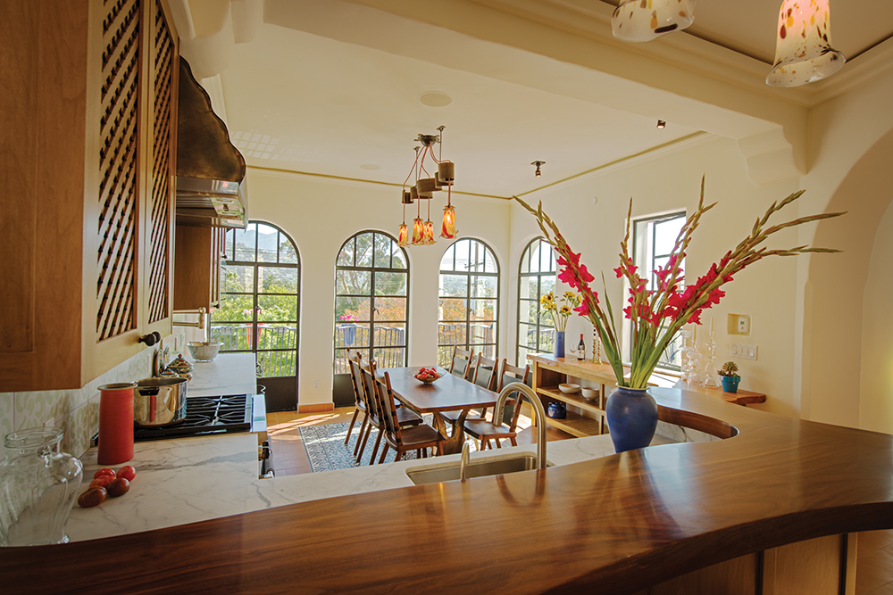
The expansiveness of the kitchen, which flows smoothly into the living room and the dining room, was achieved partially by removing a pair of heavy crossbeams and replacing them with thin structural tie rods. Beneath the classic ceiling is a complementary minimalist stroke in the form of back wall with inlaid brushed-aluminum appliances and a prep area, plus a large island made of white Corian, where gas and electric stovetops provide a dream cooking area under a large, ingeniously cantilevered brushed-aluminum hood.

The subdued palette of beiges, grays and whites with light and dark wood accents enhances the interior’s elegant simplicity while evoking driftwood, sand and other soothing natural elements. Fumed-oak floors marry graciously with the white walls, and in the two en-suite bathrooms, dark ceramic tile floors add a harmonious contrast to the custom white Corian trough sinks and the custom-made quarter-sawn oak cabinetry finished to match the wood floors elsewhere. The hearths in the living room and family room and the “urban fireplace” in the master bedroom continue the color scheme. Each is covered with a smooth steel-troweled gray plaster made to emulate the appearance of concrete.

Large pocket glass doors on both sides of the family room breezeway create an indoor-outdoor connection between the two large outdoor living areas. Inside the house, “floating” concrete platforms are used as low stairs to link the two interior levels; outside, separated by black river stones, they lead from the family room to the yard a couple of feet below and form a frame around a planter filled with large boulders and fescue grass, part of the bold, graphic landscaping by Michael Schneider of Orange Street Studio in L. A. This ranch-style home, built once as a nostalgic nod to the West, now embraces not only its owners, but also the essence of where they’ve come to live.

Smaller Homes with Heart & Soul

san roque tudor getaway

Since 1986, Giffin & Crane have built and remodeled some of the loveliest and in some cases, most expansive houses in Santa Barbara. Recently, however, they have been asked increasingly to construct or remodel homes that are smaller, more intimate, and more personal. It’s a sign of changing times and evolving tastes and priorities. As with food, wine, cars, clothing, and a whole raft of other purchases, homeowners increasingly seek quality, craftsmanship and value over square footage. Whether remodeled or newly built, homes increasingly reflect homeowners and their geographical settings. They may be more fire-resistant and feature native and other drought-tolerant plants rather than a thirsty lawn. They may have an overall reduced environmental footprint, using heating, cooling and electricity more efficiently. They may be “smart” homes, wired to respond to cellphone commands. They are easier to maintain and manage and are scaled to their owners’ reality, including the financial one. All three of the homes show here - a historic San Roque Tudor remodeled as a vacation getaway, a custom-built “modern barn” for an interior designer, and a re-imagined Mesa cottage for a downsized fresh start - fit the “living smaller” ethos, and all three have acres of personality, style and soul.

Mike and Toni Heren live in Atherton, California, but bought the 1936 San Roque Tudor showN here to use as a vacation getaway. While they were happy with the floor plan of their 1,600 square foot home, they did make some changes. Toni, a well-known landscape designer, redid the yard to make it feel more like their own. Inside, the couple left the kitchen as is (the previous owners had hired Giffin & Crane to remodel it eight years prior), but applied a big dose of TLC to other elements - the baths, lighting, and floors - to restore some of the home’s period. The Douglas fir box beams in the living room were stripped of paint and refinished to bring out the grain in wood the likes of which, Bruce Giffin says, “you can’t get anymore.” A classic but over-adorned fireplace was restored to its original brick and enhanced with a plaster surround hearth, making it a proper focal point for the airy, cozy room. The bathrooms received new tile, and the wood-framed windows were refurbished, along with their rare antique hardware. The character of this 78 year-old home now shines through brilliantly.

A FRENCH BARN FOR 2015

When interior designer Jill Hall decided to retire and swap her large Montecito home for something much smaller in Mission Canyon, something “easy and inexpensive,” she turned to Giffin & Crane to design and build the 1,700 square-foot home as a modern take on the iconic French barn. Located on the only level spot on a steep lot, the compact house nestles into the slope and provides outdoor areas where Jill can enjoy the sunset, have a barbecue or just relax. Jill chose simple, low-maintenance materials for both the interior and exterior: polished, easy-to-clean concrete floors with a super-efficient radiant heating system, galvanized corrugated zinc roofing (she “threw acid on it” to add patina) and steel-framed windows and doors. Salvaged interior doors and hardware lend character and color, as does the soothing texture of colored stucco. The garden is a unified, yet freeform oasis of drought-tolerant landscaping. Jill’s new home is at once modern and traditional, with “nothing too precious or wonderful.” It’s just the right size for the designer, who has long since “unretired,” and says she “loves living small,” and advises anyone considering the same to do as she did and build enormous closets.

LESS IS MORE ON THE MESA

When Lillian Cross found herself without her beloved late husband, she followed her children’s advice, moving out of the home where she had lived for decades and finding something new: the 50 year-old, 1,300 square-foot Mesa cottage that is now her home. Having been redone by a house-flipping speculator, a redo of the redo was in order.
Lillian identified her primary needs as a beautiful garden, a place to enjoy the outdoors, and easy-to-climb steps from the driveway to the front door. She began with the garden, hiring landscape architect Chuck McClure to redesign the yard that now includes terraced plantings and a papyrus-ringed fountain. Lillian can enjoy the landscaping from the comfort of her covered back patio, where she can read in the shade and enjoy the Santa Barbara climate. Having replaced the stairs to the front door with new ones that are much easier to navigate, she partnered with Sue Aldrich to create a warm and inviting interior. Both bathrooms were renovated, as was the kitchen, where a post was removed to improve the sight lines and a flush ceiling with recessed lighting was added. The result transformed the character of the house and brought Lillian happily into the next phase of her life.

Garden Party

It’s hard to miss a Jeff Shelton–designed building. In a world of carefully aligned conformity, his buildings are the ones doing the limbo to a cascade of slightly bent jazz notes. They can seem to tilt or careen. They wink, break rules and defy expectations at every turn. They are treasure troves of artful surprises. His newest downtown project, El Jardin, fits right in, with one foot rooted firmly in the classic Spanish vernacular that informs much of Shelton’s work, while the other dances through a Carnival street wearing yellow foam shoes and a checkered blue suit.

The mixed-use Garden Street property has a ground-floor garage, a first level of commercial space and a residence that includes two interior levels plus a rooftop deck with a hot tub, a fire pit, a dining area and an outdoor kitchen. An elevator services all levels. Likes its predecessors, this Shelton building wants its owners to have fun. “I like them to have a little bit of life, a little bit of humor and enjoyment, a little bit of celebration,” he says of the 50 or 60 buildings he has designed in Santa Barbara. By now, Shelton has heard people refer to all of the references they think they see in his work - Gaudí, Dalí, Dr. Seuss. “I love Gaudí, I love Dr. Seuss, I love sand castles,” he says, adding that other influences include Rube Goldberg and MC Escher. “And everything does droop a little bit. There’s a little bit of melting.”

The distinctive look of Shelton’s buildings is born in his own mind, but the execution he credits to his collaborators, a core group of artists and craftsmen he hires for every project. Among them are contractor Dan Upton, glass blower Saul Alcaraz of Santa Barbara Art Glass, iron worker (and brother) Dave Shelton, woodworker David Moseley, and sculptor Andy Johnson. The signature plaster work that gives his buildings their “droop” is created by a group of plasterers who have mastered Shelton’s preferred irregular surfaces and wiggly vertical edges where walls meet while embracing his general opposition to straight lines and right angles in the plaster realm. There are many plasteriffic touches here.

Some exterior walls have groupings of 24-inch-long perforations shaped like lazy exclamation points, while yellow-orange Spanish style caps top the walls. At roof level, a plaster clock tower fronting the street is topped by one of Andy Johnson’s modern gargoyles. The cartoonish face grins broadly while pointing at the clock dial below, the numbers of which are wildly out of sequence and don’t lay on the face, but stand straight out from it. “Why make plaster perfectly straight?” Shelton asks rhetorically. “That’s for steel. Plaster is plastic and has hands on it. You should be able to see that.” As a lover of Spanish vernacular architecture who also believes it should be made new, Shelton uses a lot of his brother’s wrought iron, often in light fixtures that include blown-glass from Saul Alcaraz, whose chile-pepper-shaped sconces are everywhere. The wrought iron for this building appears in details that call to mind the bulbous, globular forms of spilled viscous liquid or the morphing blobs in a lava lamp.

They show up as footings along several stairways, which have wavy wrought iron railings that suggest black ribbons rippling in a breeze. Off the kitchen, the globules appear as part of a vertigo-inducing balcony treatment. Each of four doors leads to a cantilevered wrought-iron container that fits about two people comfortably and vaguely resembles the basket on the cherry pickers used by utility-line workers. The circular “wall” of the bucket consists of closely spaced, not-quite-vertical wrought-iron rods (echoed elsewhere as stairway balasters), and those in turn are topped by the black globule-shaped iron railings, each supporting a brightly colored flower pot from California Art Pottery, another regular Shelton supplier.

Tiles of Shelton’s own design - hand-drawn, often during plane flights - are another through line of his work, and they are on vibrant display in El Jardin. An entire 20-foot-tall front-facing exterior wall is covered with blue-and-white rose-motif tiles, and the top edge of many windows is adorned with tile work that does trompe l’oeil duty, appearing to be a rolled-up awning. A street-level front door is framed by tiles having an assortment of circular motifs that could represent dishes, flying saucers, fish eyes or stylized blood platelets. Stairway risers are tiled, and the traditional Spanish red-tile living-room floor is adorned by a pair of tile “rugs.” Whether grunion, stars, abstract geometrics or squiggles, Shelton’s designs are always asymmetrical; the tiles line up no matter which way they are oriented to each other, but the design never repeats.

As if coming to terms with his own pursuit of architectural punch lines weren’t enough of a challenge, in this building he also had to incorporate more than 200 design dictates issued by the owner’s Feng Shui expert. The entrance, for instance, had to be positioned exactly in the center of the house, and the back door ended up being, well, in the front. But maybe that’s the perfect touch for a house designed by the man who never saw a design “rule” he didn’t want to tweak just a little.